







What Your IoT SIM Dashboard Should Show You (And What to Do When It Doesn’t)
August 20, 2026
5 Industries Being Transformed by 5G NTN IoT
August 26, 2026
Five Questions Every IoT Team Asks Their Network (and Why They Usually Take Too Long to Answer)
Each of these sounds like a five-second question. For most teams, it isn’t — here’s why, and what changes when it actually is.
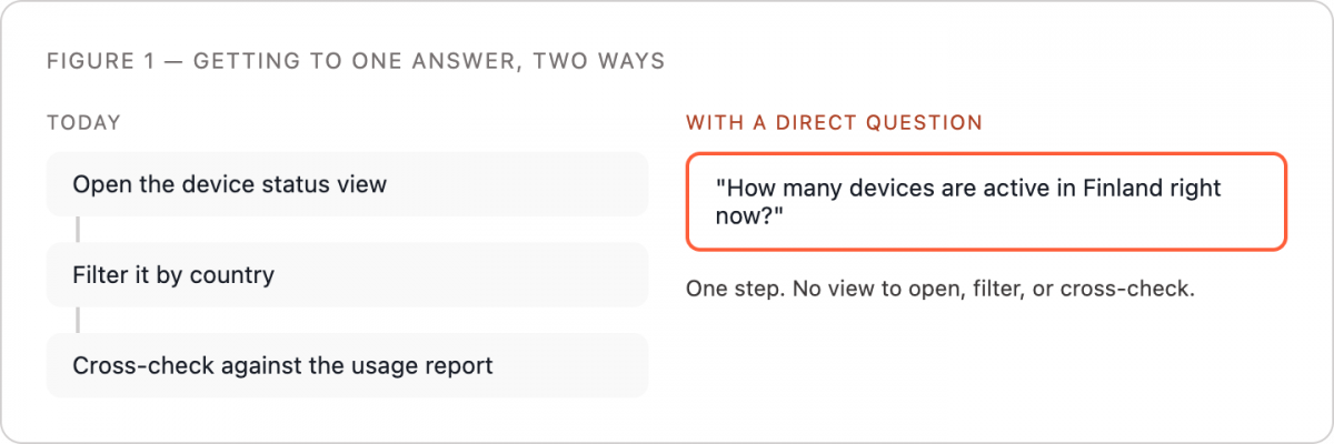
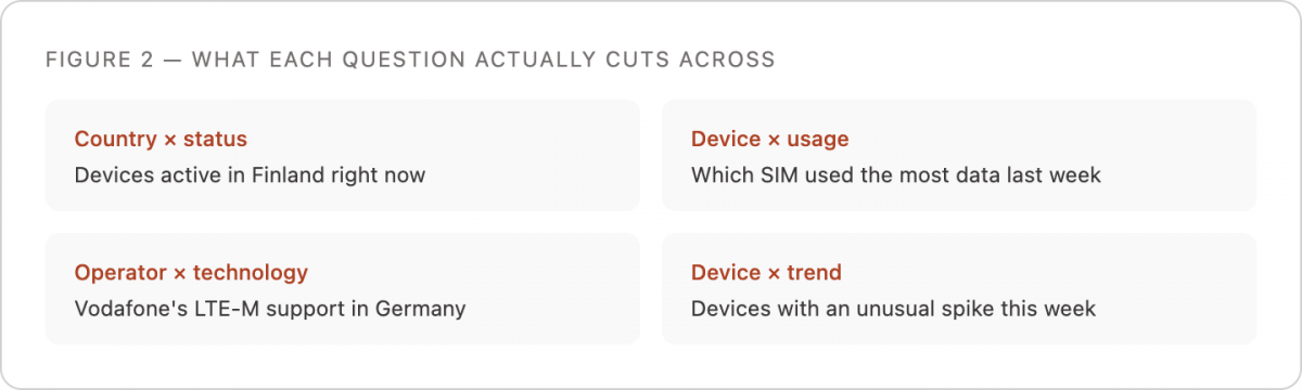
“How many devices are active in Finland right now?” “Which SIM used the most data last week?” “Does Vodafone support LTE-M in Germany?” Ask any of these out loud in a network operations meeting and someone will have a rough answer within a minute. Ask for the exact number, confirmed, sourced, and current, and the same question can take an afternoon.
Why a simple-sounding question turns into an afternoon
None of these questions are hard in the abstract. The difficulty is that the answer to each one usually lives in a different place than the question was asked. “How many devices are active in Finland” means filtering a device list by country and by connection status, which may live in two different views. “Which SIM used the most data” means sorting a usage report that most dashboards don’t let you sort the way you actually want. “Does Vodafone support LTE-M in Germany” isn’t in your account data at all; it’s a carrier and technology lookup that means leaving your own tools entirely.
Add two more questions to the list, because they follow the same pattern: “Which devices had an unusual spike in data this week?” and “Which devices have gone quiet lately?” Both are simple to state and both usually mean someone manually scanning a usage report or a connection log looking for outliers, because most dashboards show you the current state, not the anomaly.
Why IoT data makes this worse than typical IT monitoring
Standard IT monitoring tools were built around a smaller, more uniform set of things: servers, endpoints, maybe a handful of locations. An IoT fleet routinely spans multiple countries, multiple carrier technologies, and thousands of individual SIMs, each with its own usage pattern and connection history. Every one of the five questions above cuts across at least two of those dimensions — country and status, device and usage, operator and technology, device and trend.
A dashboard built to show usage by device will not, by default, also let you filter by country. A dashboard built to show device status will not, by default, flag which of those devices is behaving differently than its own baseline. Each additional dimension means either a new view someone has to build in advance, or a manual cross-reference after the fact. That is the actual mechanism behind why fleet teams often find they spend more time finding IoT data than acting on it: not because the data is missing, but because it is scattered across views that were each built for a narrower question than the one being asked.
What the delay actually costs
The cost of these delays is not evenly distributed. A usage spike that takes three days to identify has already run up data charges for three days. A device that goes quiet and is not flagged for a week is a device that has been silently offline in the field for a week, possibly at real operational cost if it is a security camera, a tracker, or a piece of monitored equipment. Connection quality issues follow the same pattern: a rising drop rate on one carrier often goes unnoticed until it has already affected a meaningful share of a fleet, at which point the fix is reactive rather than preventive — the same failure mode behind why an IoT device keeps losing connection in the first place.
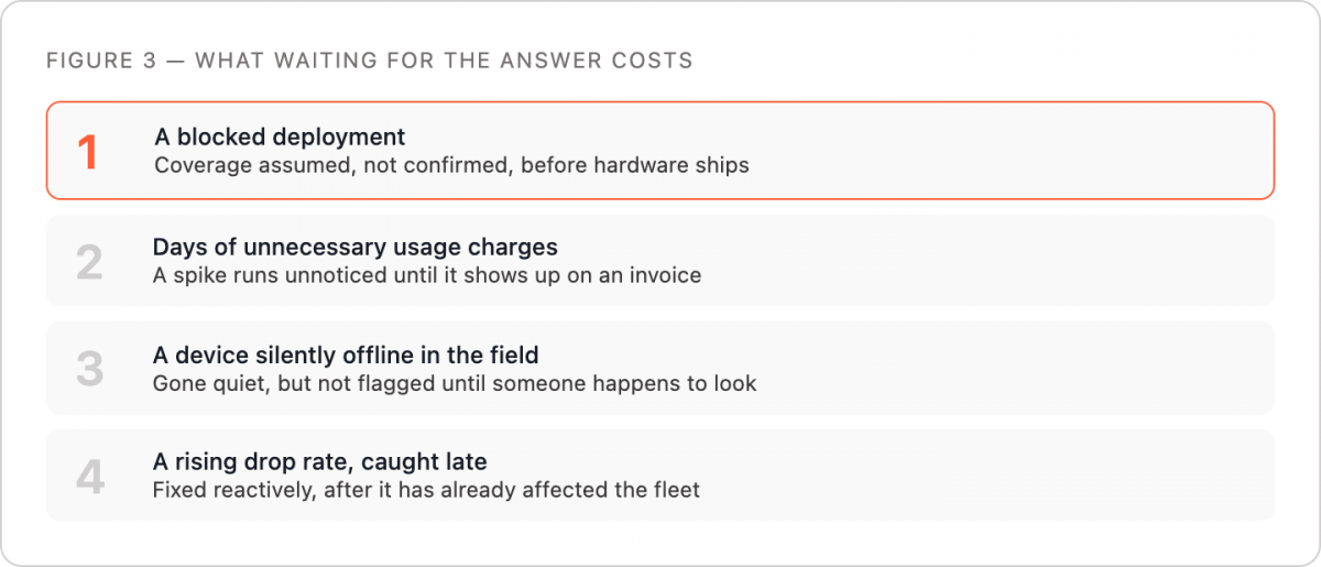
The coverage question has a different but equally real cost. A team planning a deployment in a new country that assumes an operator supports a given technology, without confirming it, can find out mid-rollout that the assumption was wrong. At that point the cost is not a data charge but a delayed launch and a scramble to find an alternative. Coverage maps lie more often than most teams expect, and confirming support ahead of time is the difference between a five-second question and a week of delay.
What changes when the answer is instant
The fix is not a new dashboard with more filters. Every additional filter option is still something a person has to know exists and remember to use. The fix is removing the dashboard from the path between the question and the answer entirely.
Three things follow from that shift. First, anomalies get caught while they are still cheap: a spike or a drop-rate change gets flagged and confirmed the same day it starts, not the week it shows up on an invoice. Second, coverage and technology questions get answered before a deployment commits to hardware, not during it. Third, the questions stop being routed through whoever happens to have report access, because asking in plain English does not require knowing where a metric lives or how to build a filtered view. That last point matters as much as the speed does — your IoT network data exists, and getting an answer from it shouldn’t take this long for anyone on the team, not just the person who happens to know the dashboard.
None of the five questions above are actually hard. What’s hard is the distance between asking them and getting an answer. Close that distance and they go back to being exactly as simple as they sound.
This article was curated by Jan Lattunen, CCO Simplex Wireless
About the Author: Jan Lattunen manages Sales and Marketing for Simplex Wireless.
Jan has 20 years’ experience in working with SIM card technology and was involved
in launching the eSIM in North America with major carriers and OEMs. His expertise
in telecommunications is around SIM cards. On a personal note, Jan is a family man
and avid cyclist with advocacy for safety in the roads. You can connect with Jan on
https://linkedin.com/in/JanLattunen